Photo by PD Rearick
“If punk birthed a thousand garage bands, it certainly birthed as many designers,” says Punk Graphics curator
By Gunseli Yalcinkaya
The curator of a new exhibition on punk graphics at Detroit’s Cranbrook Art Museum, has selected five key works that explore the movement in the United States and United Kingdom.
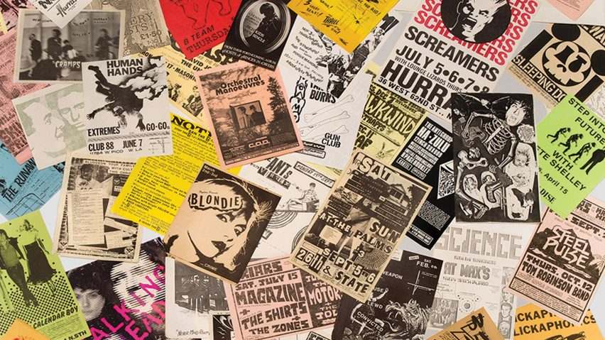
The exhibition titled Too Fast to Live, Too Young to Die: Punk Graphics 1976-1986 focuses on the visual development of punk culture between 1976 and 1986. It contains approximately 500 of punk’s most memorable graphics – including flyers, posters, albums and zines.
“Since its rebellious inception in the 1970s, punk has always exhibited very visual forms of expression,” said curator Andrew Blauvelt.
“The energy of the movement created a powerful subcultural phenomena that transcended music to affect other fields such as visual art and design,” he explained.
“Punk provided many new opportunities for designers”
The exhibition aims to show punk “as a heterogeneous design practice” by examining its range of influences, including cartoons, comics, science fiction and horror films.
Blauvelt also wanted to explore the development of DIY culture through punk zines and flyers and the use of parody and pastiche.
“For designers, punk was tremendously influential in its DIY ethos. If punk birthed a thousand garage bands, it certainly birthed as many designers,” Blauvelt told Dezeen. “There is a clear trajectory in graphic design history, where punk provided many new opportunities for designers to create work in which they passionately believed.”
“Its raw amateurism was liberating and effectively ‘deskilled’ professional design long before the computer did,” he explained. “New wave music was the primary playing field of new wave graphics. The authenticity of punk is most appealing today.”
Punk “telegraphed a more democratic approach to making culture”
A majority of the pieces were selected from an archive belonging to New York collector Andrew Krivine. “[He] owns literally thousands of works and his collection is quite broad. Its breadth gave me a unique curatorial opportunity to look at punk graphics very broadly,” said Blauvelt.
“Not only did punk reinvigorate the music scene by unleashing a thousand garage bands, it telegraphed a new more democratic, open-access approach to making culture in general. Today, things like graphic novels, alternative music stations, and street fashion all owe a debt of gratitude to punk,” he continued.
Too Fast to Live, Too Young to Die: Punk Graphics, 1976-1986 is on show at Cranbrook Art Museum between 16 June and 7 October.
Below, Blauvelt writes about five key items featured in the exhibition:
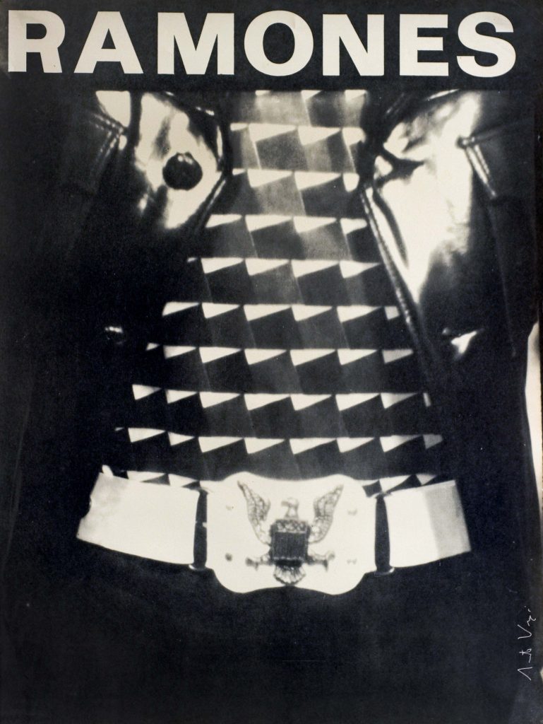
Arturo Vega, Ramones showcase poster, 1975
Arturo Vega (1947-2013) was a visual artist and is perhaps best remembered for his graphic design work for The Ramones. Vega created the band’s famous logo, a take-off of the Seal of the President of the United States, in which he replaced the eagle’s clutched arrows with a baseball bat, and the nation’s motto, E pluribus unum, with the Ramone’s Hey Ho, Let’s Go.
The eagle was a recurring motif for Vega in his own art work and one that he began to associate with the Ramones. This early poster for an unsigned bands contest at CBGB features a photograph by Vega of the artist wearing an eagle-clad belt buckle.
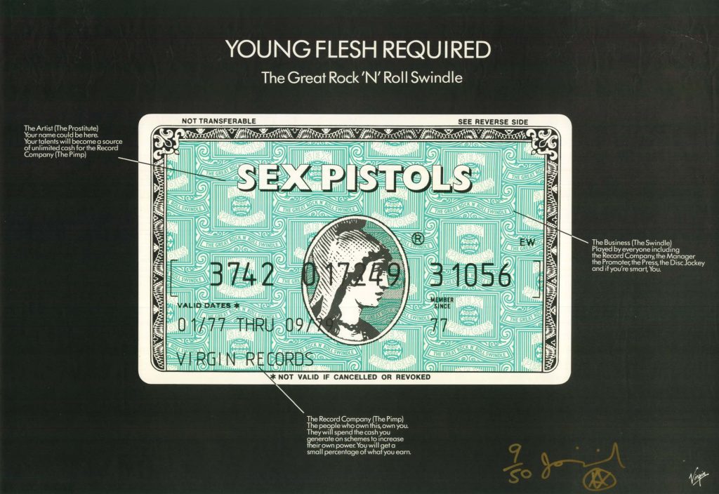
Jamie Reid, poster for The Great Rock ‘N’ Roll Swindle, 1979
Jamie Reid is perhaps punk’s best known graphic designer, having crafted the unique visual look of the Sex Pistols’ materials. Reid embraced the situationist technique of detournement, or cultural hijacking.
In this poster to promote the film, The Great Rock ‘n’ Roll Swindle, Reid appropriates the advertising campaign of American Express credit cards (“Your Name Here”). The music industry itself becomes the target, including the artist (“the prostitute”), the record company (“the pimp”), and the music business as a whole (“the swindle”).
The posters were withdrawn and most copies destroyed when American Express threatened legal action.
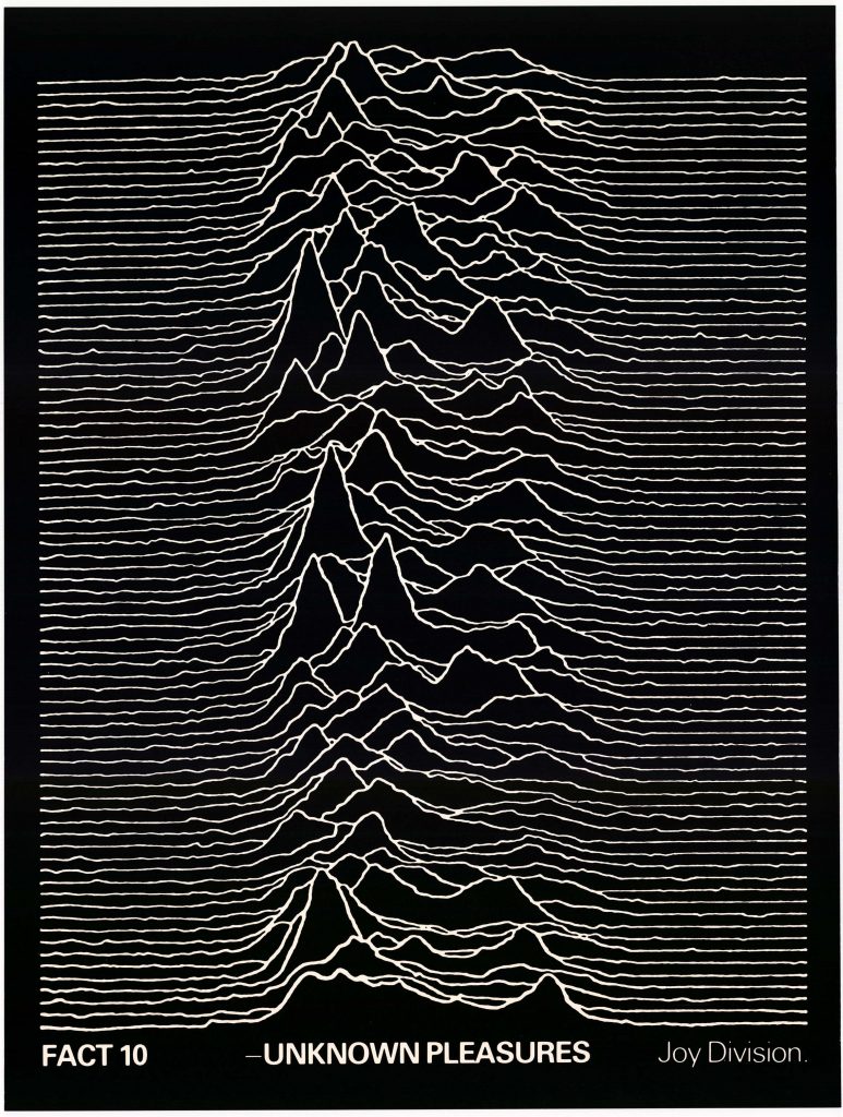
Peter Saville, poster for Joy Division Unknown Pleasures, 1979
This poster by Peter Saville, who first came to prominence for his designs for Factory Records, was issued to promote the debut album by Joy Division. The image is of successive waves recorded from a pulsar and was found in an astronomy textbook by band member Bernard Sumner. Saville reversed the image from black-on-white to white-on-black, conjuring the darker atmospherics of the album’s sound.
The design has attained an iconic status, particularly of late, even spawning the term “joyplot” in data visualization, which is used to describe a style representing successive and comparative histograms.
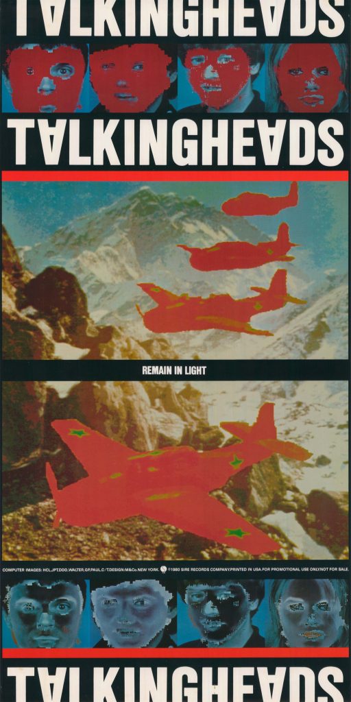
M&Co, poster for Talking Heads Remain in Light, 1980
Envisioning the look they wanted for their next album, bassist Tina Weymouth and drummer Chris Frantz of the Talking Heads worked with Walter Bender and Scott Fisher of the MIT Media Lab to create the computer-generated images used on this poster.
Weymouth and Fisher shared a passion for masks that drove the digital manipulation of the band members’ portraits. The four fighter planes flying in formation allude to the original title for the album, Attack Melody, and were a nod to Weymouth’s father, who served in the US Navy.
Tibor Kalman’s M&Co created the graphic design and the typographic treatments for the album and poster, including the use of the upside down “A” in Talking Heads.
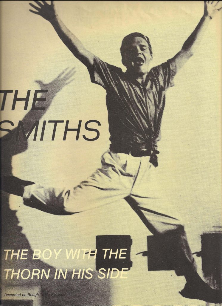
Jo Slee, poster for The Smiths The Boy with a Thorn in His Side, 1985
The Smiths lead singer and songwriter, Morrissey, eschewed the stereotypical band portraits used on record covers in favor of images of pop and film stars, including celebrities like James Dean and Candy Darling. Rendered in a range of duotones and designed by Jo Slee of Rough Trade records, The Smiths cover designs were easily identifiable and equally memorable.
For this promotional poster for the hit single, The Boy with a Thorn in His Side, Morrissey chose a photo of a young Truman Capote taken by famed photographer, Cecil Beaton.
Read the article here.
Media Inquiries:
Julie Fracker
Director of Communications
Cranbrook Academy of Art and Art Museum
248.645.3329
jfracker@cranbrook.edu.
39221 Woodward Ave Box 801
Bloomfield Hills, MI 48303
248.645.3323
artmuseum@cranbrook.edu

Copyright © 2026 Cranbrook Art Museum. All rights reserved. Created by Media Genesis.