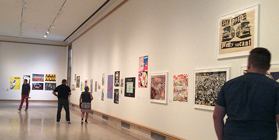
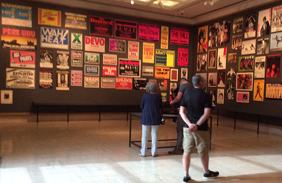
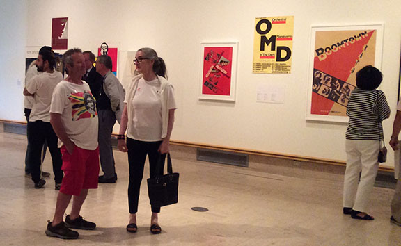
At the Cranbrook Art Museum’s new exhibition (June 16 – October 7) “Too Fast to Live, Too Young to Die: Punk Graphics, 1976-1986,” punk rock’s visual lexicon comes into focus. The retrospective exhibit is the largest of its kind and includes displays featuring posters, zines and everything in between from the massive collection of Andrew Krivine, who has assembled a major worldwide hoard of documentary treasures. The curator, Andrew Blauvelt, has done a masterful exhibit and catalog. In the broadsheet newspaper-format catalog for the show Blauvelt writes:
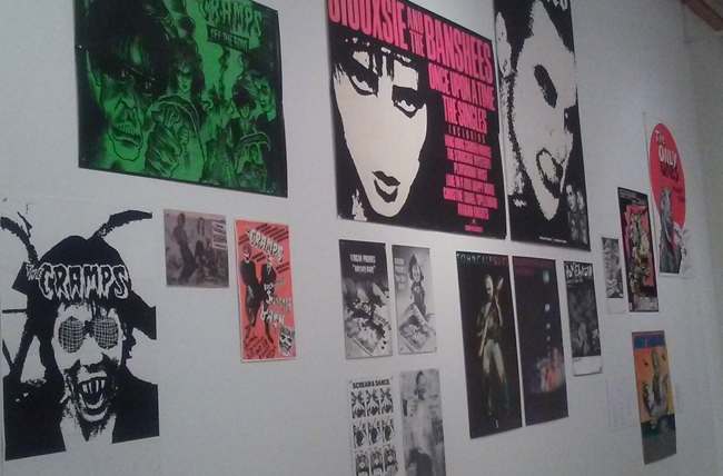
Photo by Debra Holmes
As a student and a practitioner of graphic design during the punk era (and a fan of the music), I knew from firsthand experience how the movement left an indelible impression on the field and vice versa. Reflecting on this moment some forty years later, it became much clearer how punk’s transgressive spirit upended the seemingly dogmatic rules of how graphic design should look and how it should perform (or behave). From punk, graphic design inherits the notion of “deskilling” or purposefully unlearning the imposed professionalism of the field. Punk birthed thousands of garage bands, essentially amateur musicians armed with varied degrees of talent and skill, but nevertheless uniformly primed them with a passion to make music. In the same way, punk also birthed thousands of amateur designers—artists armed with the tools and techniques of improvised publishing, determined to express their passion for punk and to connect with like-minded others. This quest for self-expression would become the forerunner of today’s DIY culture. For graphic design, punk became a fertile landscape that welcomed experiments that were once the province of largely classrooms and academies. Many of today’s leading and legendary graphic designers and visual artists began their careers, sometimes as students or band members, working with punk bands and music labels. The dismantling of modernist rules about typography and graphic layout found a sympathetic ear in emergent punk bands of the period, while record companies, as clients, underwrote a print revolution. Happening before the personal computer and desktop publishing were able to truly impact the field of graphic design, the punk and post-punk scenes blurred the distinctions between amateurs and professionals, not by lowering the technical bar of entry by making the tools of graphic design more accessible through computers, but rather by challenging the very notion of “expert” knowledge and aesthetics. Passion supplanted experience, urgency trumped refinement, and giving graphic form to a subculture replaced mass cultural norms of communication. If nothing else, punk demanded one to look differently and to think differently—and this desire fueled cross-cultural creativity.
I asked Blauvelt to talk more about the exhibit and the role of this late 20th Century phenomenon.
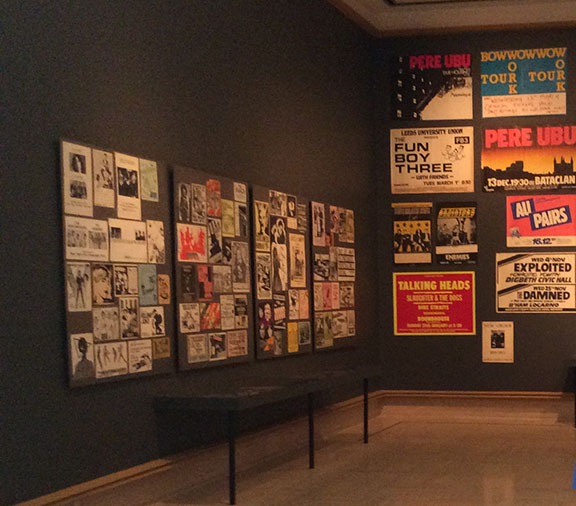
Andrew Krivine, collector. Photos by Jane Krivine
What made you decide to mount this very intense exhibition on Punk music design?
My last major exhibition, “Hippie Modernism,” was about the counterculture. That show covered the years 1964-1974. It seemed natural to want to explore the next chapter in American subcultures, and that would be punk. This shows covers 1976-1986, so punk and post-punk graphics. As a graphic designer and as a historian, I was interested in this episode of unofficial history. Punk expressed itself first through its music, second through its personal self-expression (fashion), and thirdly through its graphics (posters, album covers, flyers, zines, etc.). I have seen music history shows and punk fashion shows, but not a graphic design show. I wanted to reassess punk’s role in graphic design.
When you saw Andrew Krivine’s massive amount of material, what struck you first? A collectors passion? An historical treasure? A design phenomenon?
It was a bit overwhelming in terms of sheer quantity, with thousands of pieces, so definitely a collector’s passion for the subject. Also, Andrew (Krivine) has a deep knowledge of the design aspects of the work. So, it’s not merely memorabilia. I knew it could tell a design story about the movement, instead of the graphics serving as “ephemera” or artifacts about a musical history of punk. Because Andrew collects both punk and post-punk graphics and both the US and the UK, I knew it could cover a much broader spectrum of styles.
With all the material to choose from, how did you organize and interpret it?
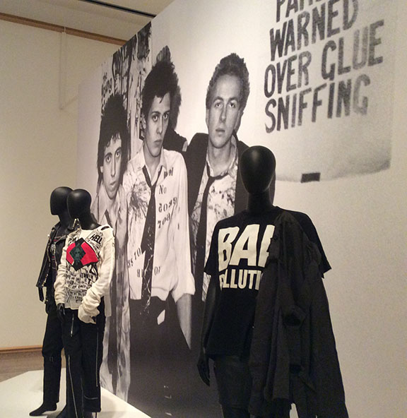
I was immediately struck with the notion that we should show the work as graphic design, and not arrange things by period or by band. So it is arranged not chronologically but rather thematically around visual strategies. So, there are sections on appropriation and on collage, with examples of parody and pastiche as rhetorical strategies. We look at the influence of art and design history on the graphics (punk is coterminous with postmodernism) as well as the impact of comics and cartoons and sci-fi and horror genres on post-punk graphics. There are also specific sections on punk typographies (found lettering or ransom note style, handwriting, typewriter fonts, as well as eclectic modern treatments) and one on new wave graphics (grids, geometric shapes, textures, hand gestures, brighter colors, etc.), which underscores the importance of post-punk graphics on the articulation of new wave styles in the market (as opposed to the academy). There is a section on the emergence of a DIY culture expressed through zines and flyers and we contrast that with commercial posters for concerts and personality posters for punk and post-punk musicians. Lastly, we look at retro style (1940s-1960s looks as well as film noir influence) and finally agit-prop (influence of Soviet and Communist propaganda styles but with progressive and left wing messages). There are about 10 sections to the show in total.
Punk is a moment in time, what is its importance for the times?
For me, punk and neocon politics (Reagan-Thatcherism) are two opposing reactions to the counterculture that preceded it. Conservatives arguing that things had gone too far and for punks not far enough. Punk and hip-hop are probably the most creatively explosive expressions of late-twentieth-century culture. Their impact goes far beyond the music. Both movements gave permission and a space for participation to many folks who probably would not have found one in mainstream channels. Punk and post-punk set the stage for DIY culture, graphic culture, alternative music, culture jamming, etc. that followed in the 1990s and beyond. Just like any subculture, it also had its own contradictions (enshrining non-conformity and individuality whilst promulgating subcultural codes and conscription) and exclusions.
Did you learn anything unexpected from grappling with all these artifacts?
I learned that the history of graphic design cannot be separated from the history of punk and post-punk graphics, which is something that I believed and suspected but had not taken the time to mentally untangle.
How would you define Punk as a visual language?
I see punk as an intrinsically heterogeneous language. I would say that punk and post-punk were rhetorical strategies more than visual styles.
What do you expect the audience to take away?
Visually, I hope that they take away a renewed admiration for the utter diversity of punk and post-punk graphics, to see it beyond a set of stylistic clichés. Socially, I hope they see that even when it seems like society has failed, there is hope through resistance, and that resistance can also be a creative expression.
Can you predict how Punk will be considered by history in the future?
I think history, especially over time, desires new discoveries, objects and designers that can be added to the canon, so to speak, to help expand and diversify it. Punk and post-punk provides ample opportunities for such discoveries, especially for those interested in a post-professional history of graphic design.
Source: PRINT MAG
Media Inquiries:
Julie Fracker
Director of Communications
Cranbrook Academy of Art and Art Museum
248.645.3329
jfracker@cranbrook.edu.
39221 Woodward Ave Box 801
Bloomfield Hills, MI 48303
248.645.3323
artmuseum@cranbrook.edu

Copyright © 2026 Cranbrook Art Museum. All rights reserved. Created by Media Genesis.