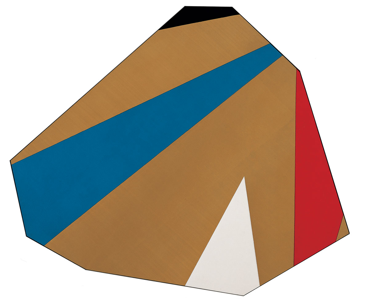
 © Kenneth Noland/Licensed by VAGA, New York, NY. Photograph by R. H. Hensleigh.
Burnt Beige, 1975
Over the course of the past four decades, Kenneth Noland has arrived at various solutions in his attempt to make work in which all elements of the picture, especially shape, serve as a vehicle for color. “I wanted to have color be the origin of painting. I was trying to neutralize the layout, the shape, the composition in order to get at the color,” said Noland about the project of his artmaking. “I wanted to make color the generative force.” At Black Mountain College in North Carolina, formal training in pure abstraction with Ilya Bolotowski and the Bauhaus master Josef Albers stressed the importance of attaining an equilibrium of color within a painting. A second formative experience in Noland’s development was a 1953 trip from Washington, D.C., to New York City with his friend Morris Louis, the Color Field painter, to see the Abstract Expressionist artist Helen Frankenthaler. Frankenthaler poured paint onto raw (unprimed) canvas lying on the floor, thus allowing the pigment to soak directly into the cloth and resulting in pictures that emphasized the flatness of their two-dimensional nature.As Noland later recalled, Frankenthaler “showed us a way to think about, and use, color.”
Noland adopted this stain technique for a series of concentric circle paintings begun in 1956, in which nested rings of vibrant, often uncomplementary colors occupied the center of a square canvas. A mix of hard-edged geometry and softer, thinly applied stains, the clash of color in these works generated a sense of outward pulsation. Continuing his exploration of the ways in which a picture’s formal structure might be used to highlight color, the artist moved to painting ellipses, and then chevrons, in which the tip of an angled shape touched the bottom edge of the work. But soon Noland, then living and working in New York City, was frustrated by the “inertia” he sensed in the empty, raw corners of the canvas. In a trajectory emblematic of the idea of modern art as a self-critical process of solving successive formal problems, he painted a series of horizontal stripes and allover “plaid” patterns in the mid-1960s before beginning to vary the rectangular shape of the canvas by tilting it off-axis and using elongated diamond or irregularly shaped formats. More recent work from the 1980s features clay, handmade paper, and canvases of acrylic paint mounted on Plexiglas.
Burnt Beige is a “notched” painting; Noland has cut away the edges of a rectangle so that no trace of its original shape remains. Indeed, by titling his work after its predominant color, Noland directs our attention to his bold, unmodulated palette. Angular bands of black, bright blue and claret red, and a small white triangle, punctuate the ochre field. The colored forms are at diagonals to the edges of the canvas, but lack a regular structure or pattern; rather, we are meant to focus on the richness and relations of the work’s constitutive colors. Burnt Beige elegantly illustrates something Noland said about this period of his work: “It took the experience of working with radical kinds of symmetry, not just a rectangle, but a diamond shape, as well as extreme extensions of shape, before I finally came to the idea of everything being unbalanced, nothing vertical, nothing horizontal, nothing parallel. I came to the fact that unbalancing has its own order. In a peculiar way, it can still end up feeling Symmetrical.”

Copyright © 2025 Cranbrook Art Museum. All rights reserved. Created by Media Genesis.