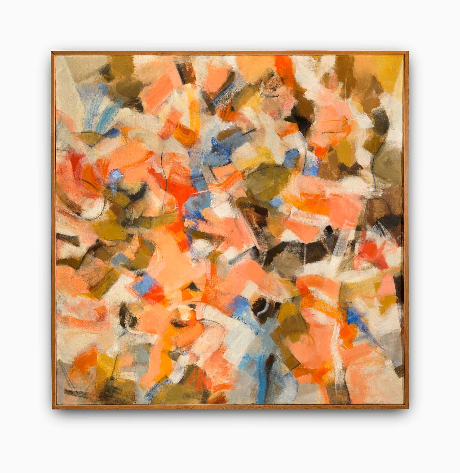
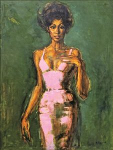
Allie McGhee has been an important pillar of the Detroit art scene for more than five decades with a practice defined by his signature approach to abstraction. This retrospective is a long overdue presentation of significant past works from McGhee’s extensive and dynamic oeuvre, as well as the premiere of ambitious new paintings created for this auspicious occasion.
In the late 1960s, McGhee shifted his practice from representational depictions because he was drawn to the long communicative history of geometry and abstraction in the timeline of humanity. One constant inspiration has been traditional African sculpture and its forms of symbolism. The title of this exhibition—Banana Moon Horn—is the name McGhee has given to the recurring arcing forms that he has explored throughout his career. The Banana Moon Horn has associations ranging from the natural world, humor, and ancient art—myriad interpretations are both intentional and welcome. McGhee often overlaps and mixes mediums by incorporating found objects or bringing a three-dimensional quality to his paintings. To this end, his collapsed canvas works have conceptual ties to McGhee’s research into science and the cosmos, often alluding to the view into a microscope or possibly collapsing universe.
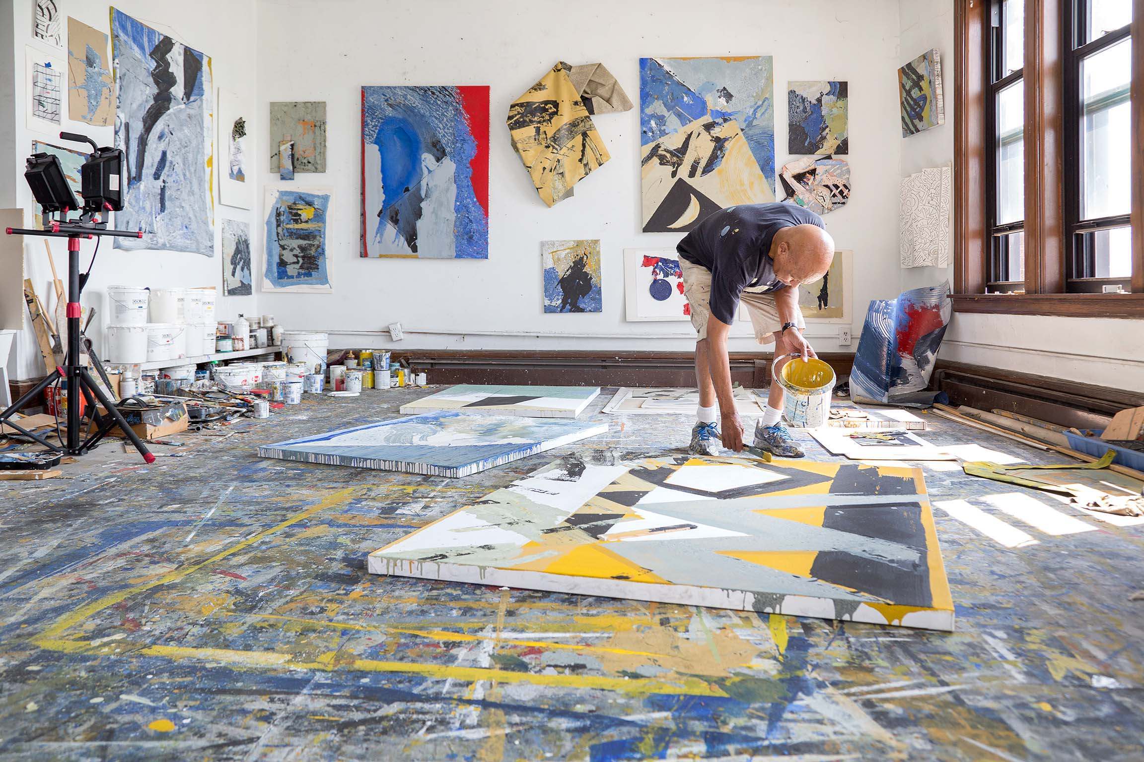 McGhee can be found in his studio “every single day except Christmas,” and this exhibition is a crescendo of his daily experiments over the years. McGhee’s vivacious mind has also rendered his studio as an important place for lively conversations across generations, particularly in the Black artistic community. The background of these discussions is often set to the sound of jazz, a musical ethos of improvisation and lyrical abstraction that also emerges throughout McGhee’s practice.
Hailing from Flint, Michigan, Tunde Olaniran is a multi-disciplinary artist, musician, singer and performer. Beginning in 2019, the museum partnered with Olaniran to help create their most ambitious project to date—the short film and exhibition Made a Universe. Olaniran worked with Detroit-based artists to create the film’s scenography, costuming, and props. These elements are re-imagined in the galleries along with a screening room, offering visitors an immersive, parallel journey through Olaniran’s creative universe.
With the narrative arc of a hero’s journey, this contemporary horror film takes its inspiration from archetypes like those found in storylines from The New Mutants, an X-Men spin-off comic book series. Within this premise, the character’s often perceived weakness translates into their unique superpower. The film examines what it means to unlock your power in the face of fear and repression, and how one must unify various fragments of their psyche to connect with the world and themselves on a deeper level.
The series, shot on location throughout Detroit, is co-written, directed, and scored by Olaniran and Paige Wood, and features collaborations across artistic mediums with several multidisciplinary, award-winning artists, including Yo-Yo Ma, Ellen Rutt, Natasha Beste, Lisa Waud, Amy Fisher-Price, Emma Davis, Skyylar Taylor, Talicia Campbell, Matthew Osmon, Terra Lockhart, Rachelle Baker, and Katy Dresner.
An experimental short film and 4D installation featuring original music from Tunde Olaniran and Yo-Yo Ma, and new work conceptualized by artists Ellen Rutt, Lisa Waud, Amy Fisher-Price, Skyylar Taylor, Natasha Beste, and Emma Davis.
STARRING
TUNDE – Tunde Olaniran
LEON – Andrew Otchere
MIKE – Michael Hatten
AARON – Segun “Delusion” Delu
BREE – Morgan Hutson
TIAH – Ash Arder
GLADYS – Carol
MW EVELYN – Ann Burns
RYAN – Richard Newman
DANCERS
Segun “Delusion” Delu, Bree Gant, Celia Benvenutti, Derrick Finley.
CREW
Director – Tunde Olaniran
Producer – Paige Wood
Co-Writers – Tunde Olaniran and Paige Wood
Cinematographer / DP – Jeremy Brockman
Art Director / Editor – Katy Dresner
Field Producer – Ryah Aqel
Assistant Director – Jackson Ezinga
First Assistant Camera – Abigail Lynch
Steadicam Operators – @steadibart and Greg Johnson
DIT / Assistant Editor – Nadeem Persico-Shammas
Gaffer – Justin Ward
Key Grip – Andy Westra, Caleb Richardson
Dolly Grip – Costa Kazaleh Sirdenis
Swing – Kirk Yoshonis, Caleb Richardson
Sound Recordist – Wayne Ramocan Jr.
Set Design: Ellen Rutt, Lisa Waud, Amy Fisher-Price, Natasha Beste, Katy Dresner
Assistant Art Director – Duncan Burns
Materials Research – Alana Weiss-Nydorf
SFX Coordinators – Devin Durocher, David Baile
Production Assistants – Karen Cardenas, Costa Kazaleh Sirdenis, Kat Goffnet, Meredith Walker, Josue Fierro, Abigail Barnett
Camera Equipment Provided By – Stratton Camera
Lighting Equipment Provided By – Courtesy Flag LLC., Detroit Power and Light
Key Hairstylist – SaRyn Byers-Johnson
SFX Make-Up – Miranda Collins Assistant
MUAs (to Skyylar Taylor) – Naomi Zeman, Jordan Stephens
Clothing and Jewelry Provided By – SMPLFD, Noir Leather, SKNDLSS, Devon Parrott Titles – Matthew Osmon RAIVAN
Original Artwork – Matthew Osmon, Rachelle Baker Catering: Fried Chicken and Caviar, Stay Fresh Express
SPECIAL THANKS to The Library Street Collective, The Jam Handy, Foster Financial, and Said and Wadha Aqel for allowing us to film in your space(s).
Produced in conjunction with Cranbrook Art Museum and curated by Chief Curator, Laura Mott. Made possible through support from The Knight Foundation, The National Endowment of the Arts, The Library Street Collective, Jennifer and Dan Gilbert, and Don Manvel.
Tunde Olaniran: Made A Universe is organized by Cranbrook Art Museum and curated by Chief Curator, Laura Mott. The film series is produced by Paige Wood. The project is generously supported by The John S. and James L. Knight Foundation, the National Endowment for the Arts, Jennifer and Dan Gilbert, Don Manvel, and additional support by Library Street Collective.
Tunde Olaniran: Made A Universe is presented by Flagstar Bank.

Olga de Amaral, one of the most recognized names in Latin American art, lives and works in her native Bogotá, Colombia. Tracing the artist’s career over five decades, Olga de Amaral: To Weave a Rock is the artist’s first major museum retrospective in the United States, consisting of some 60 works that elucidate her seminal influence and technical innovations. The artist was first introduced to the medium of fiber during her studies with Marianne Strengell at Cranbrook Academy of Art from 1954-1955. Since that time her work has prolifically evolved beyond the functional qualities of weaving into more experimental and sculptural woven forms.
Amaral’s woven sculptures are the result of a lifetime of experimentation and material studies drawing on techniques like plaiting and wrapping, using materials as varied as horsehair and gold leaf. Amaral has formed a unique visual language of abstraction that draws upon Colombia’s landscape and history as well as the artist’s own identity. Taking its title from an assignment Amaral had given to her students at the famed Haystack craft school in 1967, the exhibition Olga de Amaral: To Weave a Rock poetically expounds on her expansive views of textile practice. Still practicing in her eighties, Olga de Amaral’s work offers a prescient exploration of the expressive potential of fiber at a moment of renewed interest in the medium by contemporary artists and historians alike.

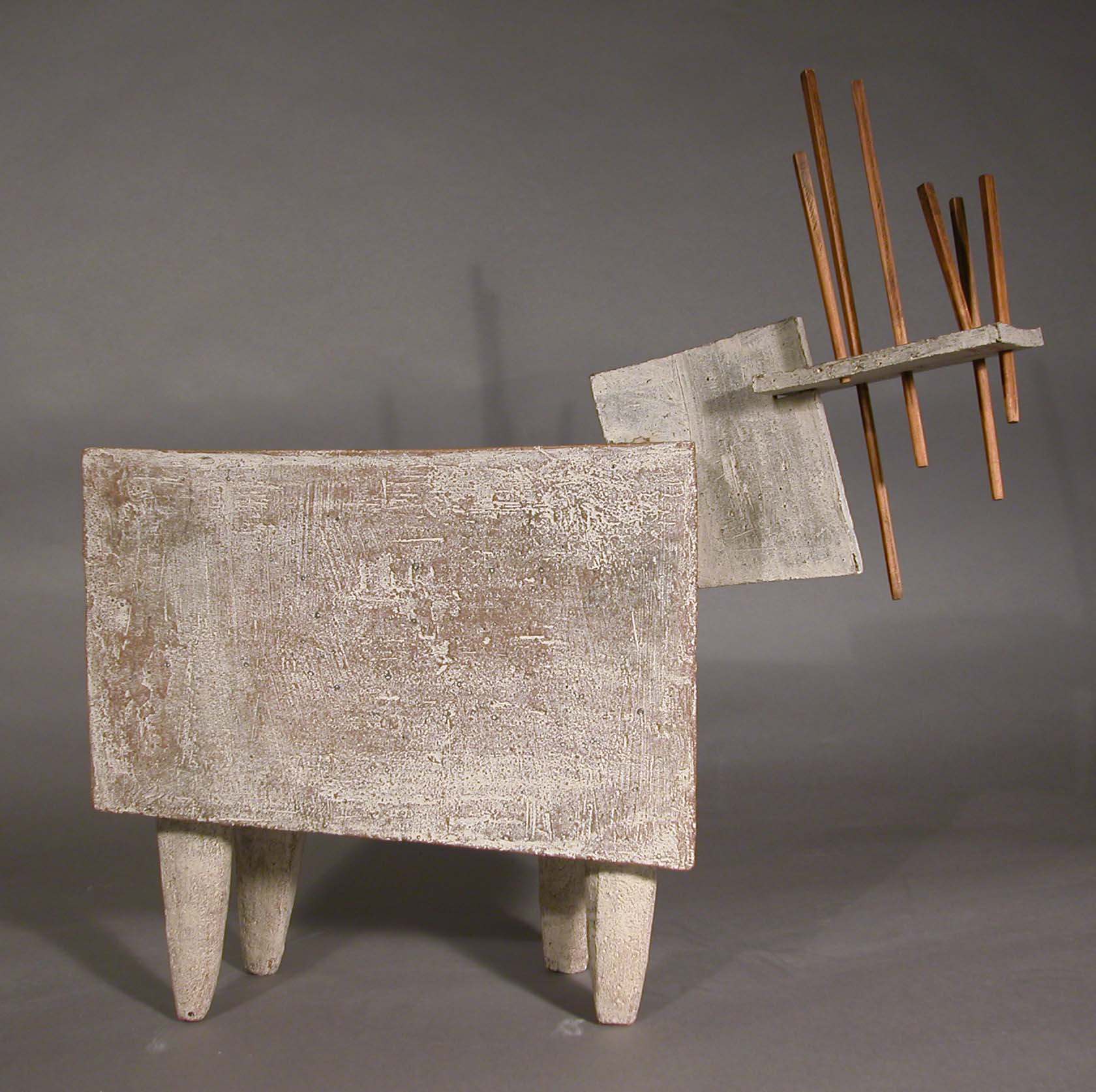
Shapeshifters explores the artist’s ability to redefine themselves, transgress their chosen medium, and transcend the world around them in utterly unique ways. Through the lens of artistry, these transformations are examined in a broad range of artworks from the museum’s permanent collection, presented in four galleries, each with a distinct focus. “Freeze Frame” panels are located throughout the galleries that focus on specific artists and tell their stories of artistic risk and innovation.
Hard Edge/Blurred Lines considers abstraction as an aesthetic strategy to unearth a wealth of individual approaches and philosophies, ranging from ancient sacred geometries to urgent societal concerns. For instance, post-war artists such as Jo Baer and Agnes Martin embrace their own versions of abstraction as a form of visual language that transcend patriarchal narratives—beyond nation, gender, and societal hierarchy. Martin in particular saw her work as a lineage from ancient Egyptian, Chinese, Greek, and Arabic artists. Similarly, Ato Ribeiro (Cranbrook Academy of Art ’17) creates wooden compositions that are informed by the ancestral communication set into the patterns of Ghanaian Kente cloth and African American quilts. Alternately, an adjacent gallery investigates the amorphous possibilities of abstract painting to create an alternate expression of the world. Processes that embrace movement and spontaneity are evident in the work of Joan Mitchell, Sam Gilliam, and José Joya, while the painterly glazed surfaces of ceramicist Toshiko Takaezu are experimental collaborations with the fire of the kiln.
If abstraction in art promised to transcend conventional depictions of reality, then photography offered to capture it. But such an expectation are subverted by artists who use photographic processes and images in their work to expand the definition of their respective medium. Exploding the Frame presents artworks that utilize alternative methods and unconventional strategies. For example, Brittany Nelson (CAA ’11) employs camera-less photography based on nineteenth-century darkroom techniques, merging them with the digital to expand photography beyond the representational, while Robert Rauschenberg’s collage-based works appropriate images from existing photographs to bridge the gap between documentation and invention.
Transformation as an act of claiming agency and asserting dignity in contemporary art is thematically explored in Sea Change. Through processes of foregrounding, altering, shielding, and abstracting the human figure, these artists create works that psychologically mirror the complexity of societal constructs and inequalities. Richard Yarde brings center stage larger than life figures from African American culture, setting them in the scale of monumental portraiture historically reserved for colonizers. From a new generation of masterfully skilled figurative painters, Conrad Egyir (CAA ’18) presents himself in three different shades of skin color challenging the systemic hierarchies of identity, while Marianna Olague’s (CAA ’19) portraits feature individuals from her personal history living on the US-Mexico border, giving prominence to those often marginalized.
Exhibited for the first time at the museum, Nick Cave’s (CAA ’89) Up Right: Detroit is a short film created during the artist’s exhibition and performance series Nick Cave: Here Hear in 2015. Commissioned by Cranbrook Art Museum, the film features a powerful transformation of selfhood orchestrated with participants from the Ruth Ellis Center, a center for LGBTQ+ youth, and the Mosaic Youth Theatre from Detroit. In a rite of passage ceremony, “Practitioners” dress “Initiates” in Cave’s canonical Soundsuits created especially for this work. The participants undergo a metamorphosis through the initiation, emerging as strong and fearless beings.
Shapeshifters features works from the collection by Richard Anuszkiewicz, Jo Baer, Ebitenyefa Baralaye, Romare Bearden, McArthur Binion, Susan Goethel Campbell, Anthony Caro, Nick Cave, Nicole Cherubini, Sonya Clark, Liz Cohen, Conrad Egyir, Beverly Fishman, Kottie Gaydos, Sam Gilliam, Kara Güt, Carole Harris, Matthew Angelo Harrison, José Joya, Donald Judd, Agnes Martin, Allie McGhee, Marilyn Minter, Brittany Nelson, Kenneth Noland, Marianna Olague, Robert Rauschenberg, Ato Ribeiro, James Rosenquist, Beau Sinchai, Julian Stanczak, Frank Stella, Maya Stovall, Toshiko Takaezu, Carl Toth, Kara Walker, Andy Warhol, and Richard Yarde, among others.
Purchase general admission here.
For more information about Shapeshifters: Transformations in Contemporary Art, click here.
Shapeshifters is indebted to the significant gifts on view from the Dr. John and Rose Shuey Collection, the Andy Warhol Foundation for the Visual Arts, and recent acquisitions from the Estate of George Francoeur and Gerald Earls.
Cranbrook Art Museum is generously supported by the Maxine and Stuart Frankel Foundation, the Fred A. and Barbara M. Erb Foundation, the Kresge Foundation, the MASCO Foundation, and the Museum Committee and ArtMembers at Cranbrook.

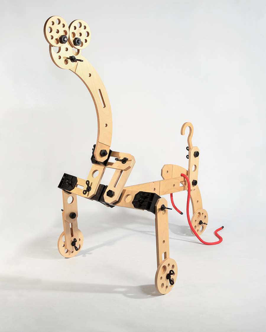
The most innovative work from the next generation of architects, artists, and designers will be on display at the 2021 Graduate Degree Exhibition of Cranbrook Academy of Art. The Degree Exhibition showcases pieces that are the culmination of two years of studio work from a diverse group of graduates as they launch their careers.
The show opens to the public on Sunday, April 18, with a special ArtMembers Preview Day on Saturday, April 17. In compliance with safety and health regulations, all visits must be scheduled in advance.
In 1932, a remarkable educational experiment opened on the Cranbrook campus in the suburbs of Detroit, a new Academy of Art for advanced studies in the visual arts. Described by the New York Times as “part laboratory, part atelier, and part artist’s colony,” Cranbrook Academy of Art dedicated itself to the education of artists, architects, designers, and craftspeople. Rooted in the contemporary, its mission and vision was simple: to support the individual artist’s search for an expression unique and resonant to her time. Widely considered the cradle of mid-century design in America, the Academy quickly became a national and international leader, a reputation that holds true today as one of the top-ranked programs of its kind in the world.
Conceived as a radical experiment in the education of artists, Cranbrook Academy of Art rejected the academic and theoretical focus of arts education of the day and instead embraced individual creativity and expression through the actual making of work as a cornerstone of its philosophy. It encouraged the exploration of alternative materials, innovative processes, and new ideas across disciplines through both self-education as well as collaboration with peers. In this way, it was and remains a student-centric pedagogical environment.
The Academy not only pioneered a more organic and human-centric approach to modern design in America starting in the 1930s and helped shape the Studio Craft movement in America in the postwar period, but also radicalized the fields of architecture and design in the 1980s during the advent of postmodernism. Although many schools of radical art and design emerged in the twentieth century–places such as the Bauhaus or Black Mountain College–only Cranbrook Academy of Art remains today as a vital force in the worlds of art, architecture, craft, and design.
With Eyes Opened, surveys the history of the Academy since its official founding in 1932. With more than 250 works representing the various programs of study at the school–architecture, ceramics, design, fiber, metals, painting, photography, printmaking, and sculpture–the exhibition occupies all of the museum’s galleries. The largest such examination of the Academy since the landmark 1983 exhibition, Design in America, With Eyes Opened will be accompanied by a 600-plus page publication that chronicles the history of this storied institution and will feature 200 alumni representing the various programs of study, both historical figures and emerging voices, who have made remarkable contributions to the visual arts.
The exhibition is organized into a series of nine galleries that highlight the Academy’s contributions to the fields of art, architecture, craft, and design.
 Cranbrook Academy of Art achieved acclaim for its innovations in architecture and design from the start. Led by the Academy’s founding President Eliel Saarinen, the program attracted top talent, including Charles Eames, who would meet his wife Ray Kaiser at Cranbrook and together became arguably the most important designers in twentieth-century America.
Florence Knoll would revolutionize modern office design for corporate America. Her friends at Cranbrook, such as Harry Bertoia and Eero Saarinen would introduce now-iconic furniture pieces for her company, Knoll International. This hotbed of talent would incubate a particularly American version of modern design, earning the Academy the moniker of the “cradle of mid-century modernism.”
These innovators would be followed by other designers such as Ruth Adler Schnee, Gere Kavanaugh, Clyde Burt, and John Risley, all of whom embraced wit and whimsy. The sculptural and expressive Brutalist furniture of artists such as Paul Evans continues through the contemporary designs of Chris Schanck and Jack Craig. Radical experiments in furniture, such as Urban Jupena’s fibrous lounge seating element, Ken Isaacs’ build-it-yourself Superchair, and an early pioneer of human-centered design and ergonomics—Niels Diffrient’s Humanscale each charted new design horizons.
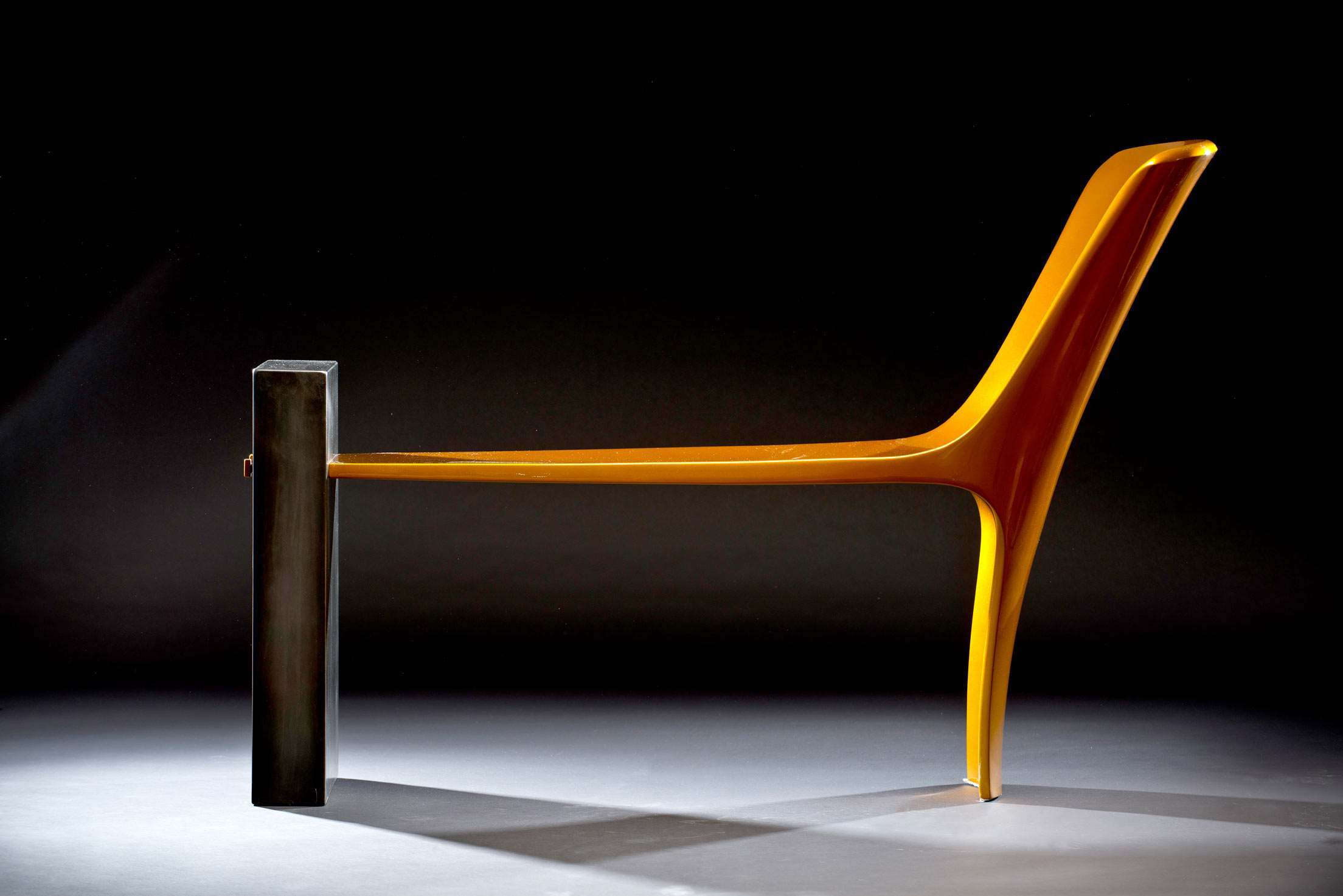
 No other design school has had more alumni and faculty contribute to the development of the modern chair than Cranbrook. Charles and Ray Eames created innovative chairs for Herman Miller, while Eero Saarinen, Harry Bertoia, and Florence Knoll added their designs to the Knoll portfolio.
Cranbrook dominated the genre of stacking chairs, with innovations by Don Albinson, whose clever design kept a stack of chairs in perfect alignment, David Rowland, who created a high-density stacker, and Hugh Acton, who designed the first ergonomic stacking armchair. Office task chairs were created by former Designer-in-Residence Michael McCoy, and alumni Niels Diffrient, and Charles and Ray Eames.
Cranbrook and the Chair celebrates artist-designed furniture, which has also been pioneered by the Academy through the work of Terence Main, Chris Schanck, Jonathan Muecke, Vivian Beer, Jack Craig, Jay Sae Jung Oh, and Evan Fay, among many others.
 With no formal classes, the Academy is known for artists and designers who work across and between artistic mediums. In the Mixing Chamber gallery, we highlight the interdisciplinary nature of Cranbrook by featuring a new immersive mural by Cleon Peterson, who studied graphic design but practices primarily as a visual artist. In the center of the space is a chaise lounge by Vivian Beer, a Metals alum who primarily works in furniture. In a nod to the historic use of this space, we have created a contemporary rendition of this once classical gallery with a new sculpture by Tony Matelli framed by floor-to-ceiling draperies designed by Ruth Adler Schnee, whose 1948 design, Strata, was adapted by KnollTextiles in 2012.
Although the age of the artists shown in this gallery is separated by nearly a half-century, there is shared energy that captures how artists can push boundaries and transcend disciplines in their search for the new.
 In a dramatic floor-to-ceiling installation of paintings, photographs, prints, and sculptures, this gallery highlights the use of abstraction across the Academy.
As a complement to the figurative work of artists-in-residence Carl Milles and Zoltan Sepeshy, abstraction would enter the Academy through artists such as Harry Bertoia, and painting instructor Wallace Mitchell. Alumni such as José Joya, Frank Okada, and Wook-kyung Choi devoted their painting practices to abstraction. The canvas itself becomes a shaped figure in the work of artist-in-residence George Ortman, John Torreano, and artist-in-residence Beverly Fishman, whose pieces attain sculptural depth and symbolic meaning.
The materiality of painting is foregrounded in works by Jessica Dickinson, Rosalind Tallmadge, and James Benjamin Franklin, each of whom enhance painting’s tactile dimension through substances like plaster, epoxy, sand, sequin fabric, or carpet.
In the 1980s, Carl Toth used the photocopier machine as a camera, combining images through collage. Contemporary artists such as Sheida Soleimani and Chanel Von Habsburg-Lothringen use photomontage to explore themes of violence and gender, while the camera-less images of Brittany Nelson use antique photographic processes to create alternative imagescapes.
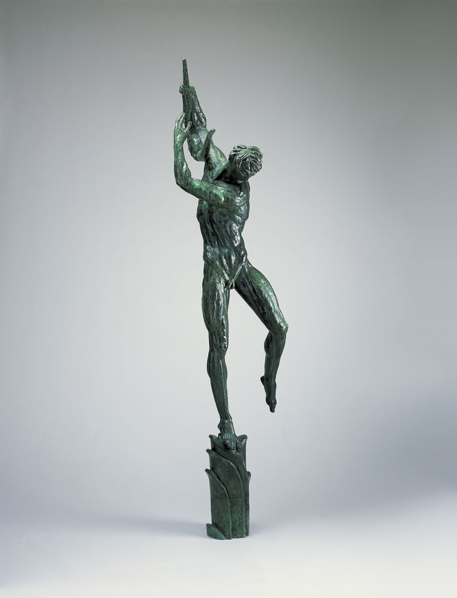 Sculpture is a founding discipline at Cranbrook, originally led by Carl Milles, whose 69 bronze figures adorn the Cranbrook campus. Milles attracted students such as Marshall Fredericks, who would go on to create Detroit’s iconic Spirit of Detroit. The figurative impulse would continue in Duane Hanson’s life-like sculptures of people or the surreal animal-human hybrids of Kate Clark, counterbalanced by more abstract approaches, such as Tony Rosenthal’s Cranbrook Cube. Other artists have explored found materials and everyday objects as points of departure, such as Donald Lipski and James Surls, or artist-in-residence Heather McGill.
The scale and freedom of sculpture appealed to students in other departments as well, particularly the crafts. Large-scale fiber works by Olga de Amaral, Sonya Clark, and Nick Cave are complemented by the ceramics of Toshiko Takaezu and artist-in-residence Jun Kaneko. Even the practice of architecture at Cranbrook is akin to sculpture, as seen in the designs of Eero Saarinen and contemporary practitioners, such as Hani Rashid.
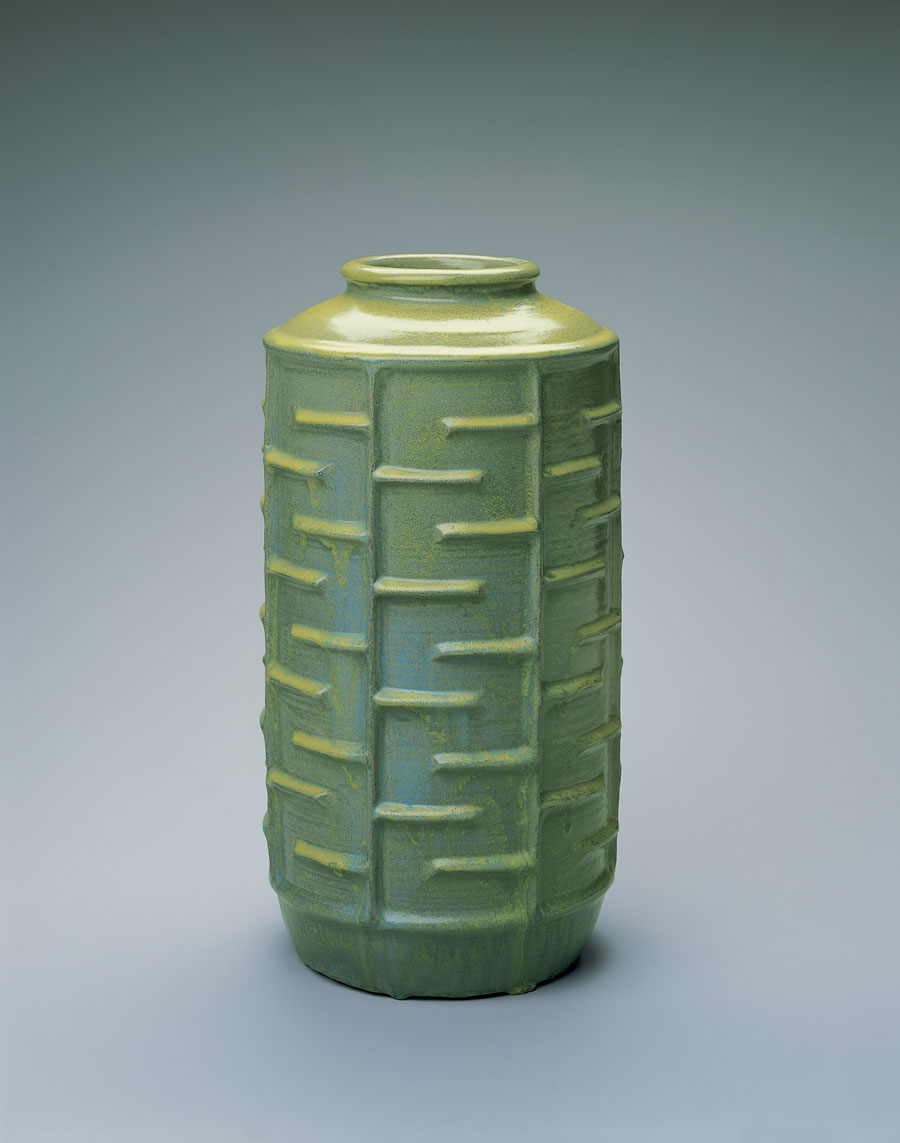 The object plays a profound role in the education of artists at Cranbrook, serving as evidence of time spent making in the studio giving form to innumerable ideas. This seems especially so in the fields of Ceramics, Fiber, and Metals, which have enjoyed great reputations at Cranbrook.
Although described by their respective materials, each discipline has exceeded such boundaries, as witnessed by ceramicists such as artist-in-residence Richard DeVore, Annabeth Rosen, and Marie Woo. In Metals, Myra Mimlitsch-Gray explores the social history of the material, while an artist such as Chunghi Choo has perfected the ability to sculpt her fluid forms in metal. Artists such as Joan Livingstone and Anne Wilson continue to push the boundaries of the field of fiber.
The desire to upend expectations can be seen in the “anti-jewelry” of J. Fred Woell or in the work of artist-in-residence Iris Eichenberg; the radical basket weaving of Lillian Elliott and her mentor Ed Rossbach; or the creation of the field of studio glass by Harvey Littleton, who had studied Ceramics. Even in the design fields, the influence of crafts can be found in the experimental use of materials and techniques and the beauty of handcrafted product design models made before the era of 3D printing and computer modeling.
Cranbrook artists continue to re-conceptualize the portrait through painting, sculpture, and photography, reinventing the traditional genre through a contemporary lens.
Work by Zoltan Sepeshy and Artis Lane shows each one’s approach of capturing the sitter’s essence through a figural likeness. Painter Charles Pachter has collaborated with his friend author Margret Atwood, capturing her spirit on canvas. Marianna Olague, Jova Lynne, and Conrad Egyir explore the social and political underpinnings of portraiture while reclaiming space for their subjects.
Corine Vermeulen and Liz Cohen use the documentary style of photography, but add their contemporary interpretations to transform the work into narratives of their subjects while Shanna Merola and Ricky Weaver employ the techniques of collage and doubling respectively to disrupt distinct identities. Shiva Ahmadi infuses the Persian tradition of miniature painting with social critique while Sarah Catherine Blanchette subverts familiar forms in favor of fragmentation and re-materialization, turning photos into luxurious fiber.
 Just as artists have historically drawn inspiration from the animal kingdom, this menagerie illustrates the ongoing relationship between man and beast. Marshall Fredericks’ Two Bears and Carl Milles’ Running Dogs appear alongside abstracted interpretations of wildlife such as Betty Ford’s angular Fox and Gabriel Kohn’s boxy, horned Animal. Tapping into the surreal, Patricia O’Connor’s Domesticated Affection deconstructs the lovebird, while Stephen Milanowski’s Cafeteria captures a perplexing, humorous mise-en-scene: a bison in a cramped dining hall. Waylande Gregory’s large-scale aquatic figures conflate fantasy and reality.
This gallery extends the collection beyond the museum walls, showcasing sketches for many of the naturally-inspired works found on Cranbrook’s campus, from the Milles’ sketches for both Europa and the Bull and Running Dogs to small decorative elements such as Fredericks’ water spigots which take the shape of a Japanese goldfish, lizard, and frog.
 The print and the poster at Cranbrook remain dominant forms of expression for both artists and designers. Printmaking (now Print Media) became its own department at the Academy in the 1960s under Laurence Barker, who accelerated the trend of hand papermaking in America through the 1970s and 1980s. Alumni such as Winifred Lutz have showcased paper as both a material and medium.
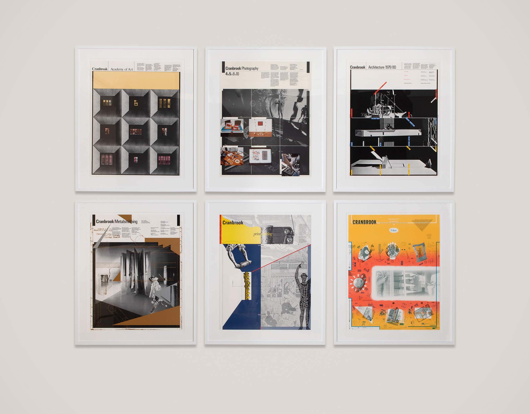
The reputation of the Academy’s influential graphic design program grew tremendously through its use of the medium from the 1970s through the 1990s under the tenure of designer-in-residence Katherine McCoy. The use of collage and photomontage techniques that layered provocative photography and illustration with progressive typography, decades before the desktop computer, can be seen in the promotional posters for Academy programs created by her and students of the design program in the 1970s and 1980s.
More oblique statements and personal messages dominated the poster work from designers in the 1980s and 1990s, and this tradition of experimental design continues with designer-in-residence Elliott Earls, whose prints, installations, and video work routinely crosses media and transcends disciplinary expectations.
Jim Miller-Melberg, who studied sculpture, supplied cast concrete playground features to parks around the country for decades through his company, Form. Millions of children have likely played on his iconic, mid-century designs that included abstract forms along with signature animals, such as his turtles, porpoises, and camels.
Cranbrook Art Museum is grateful to the following for their generous support of the exhibition and publication:
Major Sponsors
Sculpture Court Sponsor
Major Gallery Sponsors
Gallery and Artist Sponsors
In-Kind Sponsors
(as of May 7, 2021)
Christy Matson is a Los Angeles-based artist known for her painterly approach to textiles. Matson employs a hand-operated, computer-programmable Jacquard loom to create intricate weavings to which she often applies paint and other fiber techniques. The artist mines her deep interests in approaches such as collage and abstraction, which can be found in both historical as well as modernist textile traditions. Matson’s work reflects on the gendered histories of weaving in conjunction with art historical approaches such as geometric abstraction and collage.
Christy Matson: Crossings features 16 weavings configured into 2 monumentally scaled tapestries that were originally conceived for a special commission for the US Embassy in Ashgabat, Turkmenistan. Matson was struck by the affinities between the country’s textile traditions and the approach to color and composition in the functional textiles of the region more generally and her own work, including the use of both muted natural and saturated synthetic dyes and the collaging of different fabrics in the signature patchworked garments of the region. Additionally, Matson will present a selection of smaller recent works that continue her reflections on historic weave structures in conjunction with her unique approach to pastiche and collage.
Recent exhibitions by the artist have been held at the Long Beach Museum of Art, Craft and Folk Art Museum Los Angeles, Museum of Contemporary Arts Houston, The Milwaukee Art Museum, The Knoxville Museum of Art, the Asheville Museum of Art, and The San Francisco Museum of Craft+Design. Matson’s work is in the collections of the Art Institute of Chicago; the Smithsonian Museum of American Art’s Renwick Gallery in Washington, DC; and numerous corporate and private collections.
Christy Matson: Crossings was organized by Cranbrook Art Museum with the assistance of Volume Gallery, Chicago, and supported by the Maxine and Stuart Frankel Foundation, members of the Museum Committee, and ArtMembers of Cranbrook Art Museum.
This retrospective exhibition of the work of textile and interior designer Ruth Adler Schnee (b. 1923), still in active practice at age 96, affirms her pivotal role in the development of the modern interior. The exhibition presents at its core the body of textile patterns that Adler Schnee has created over the course of her prolific seven-decade career, including the screen-printed fabrics that helped define mid-century American modernism as well as their later translation into woven textiles. These designs become the filament that weaves throughout Adler Schnee’s professional networks, crossing between her and her husband’s retail entrepreneurship and her interior design commissions and architectural collaborations.
Born to a German Jewish family in Frankfurt, Germany, her mother’s Bauhaus training and creative circle of friends developed Adler Schnee’s interest in vibrant use of colors, rich textures, modern form, and the thoughtful study of architectural space from an early age. Following the Nazis’ Kristallnacht pogrom of 1938, the Adler family fled to the United States and settled in Detroit. First studying fashion design at Cass Technical High School and interior architecture at the Rhode Island School of Design, Adler Schnee received an MFA in Design from Cranbrook Academy of Art in 1946, becoming one of the first women to receive this degree. She went on to found a design consulting firm and modern design shop in Detroit with her husband Edward Schnee, launching a business which brought good design into important modern homes for over half a century.
Vintage textiles, archival drawings, and photography, and assorted ephemera, as well as her ongoing textile collaborations with companies such as Anzea Textiles and KnollTextiles, come together in an architectonic display to illuminate the underrepresented narrative of how women shaped the direction and reception of modernism in postwar America. The exhibition reveals her rigorous, iterative design processes and presents the more ephemeral residential and commercial interior design projects alongside the material through-line of her textiles.
An extensive 200-page publication accompanies the exhibition and situates Adler Schnee’s practice within her professional network of peers and collaborators—such as Alexander Girard, Jack Lenor Larsen, Angelo Testa, Albert Kahn, Eero Saarinen, and Minoru Yamasaki—while documenting her textile oeuvre and her fascinating life’s journey.
This exhibition is supported by the Graham Foundation for the Advanced Study in the Fine Arts.
Ruth Adler Schnee is organized by Cranbrook Art Museum and curated by Ian Gabriel Wilson, the Jeanne and Ralph Graham Collections Fellow. The exhibition is made possible with support from the Clannad Foundation and the Maxine and Stuart Frankel Foundation.
August 29, 1981
Cranbrook in 1946 was an enchanted place! A liberal European background and Beaux Arts training at the Rhode Island School of Design during wartime, hardly prepared me for it.
Harry Bertoia, Charles Eames, Ray Kaiser (later Eames), Florence Schust (later Knoll), and Harry Weese were no longer the all-star cast. But their spirit of experimental design, so enthusiastically fostered and promoted by the Saarinens, was still all-pervasive.
Ideas of using organic forms in design, coupled with new and untried materials in ingenious and revolutionary methods, were difficult to absorb. It took two months of the precious nine months of my fellowship period to make the personal adjustment. I deplored this loss of time. But once I realized that the “world was my oyster”: that there were no limitations except those posed by myself, I produced.
It was the most exhilarating experience to watch my work unfold from day to day.
Evenings at Saarinen House are long remembered. Discussion on design and creative processes were always the topic. Loja would be ensconced on a hard bench, cushioned by only one of her tapestries draped from the ceiling, across the bench and to the floor. Eliel sat on a stiff ceremonial chair of his own design. He was exceedingly comfortable there, so he always said. We students lounged at their feet.
There, I learned design discipline. I learned the philosophy which governs my entire life. In Eliel’s words, “Art and Design cannot be taught; it must be learned”.
Little did I realize then that the training and thoughts first formed at Cranbrook would make my life so very difficult, but so rewarding. They set standards by which I judge my work. And, to the frequent dismay of my husband and children, they often become the system of rules governing conduct. But they also serve to develop success.
I am a diligent designer. I love my craft and work hard at it, often late into the night. I am meticulous, making hundreds of sketches. I am proud of my design process. Saarinen and Cranbrook taught me so.
As I look back on thirty-five years of great pleasure and great agony in my chosen profession, I know that Saarinen and Cranbrook opened the doors to my lonely world. But it is a world so full of dynamism and exploded color that I hope to spend the rest of my life giving new direction to
Established concepts. Saarinen and Cranbrook taught me so.
Material Detroit is a free performance and public art series that complements the exhibition and publication, Landlord Colors: On Art, Economy, and Materiality. Sited in Detroit and created in partnership with ARTS.BLACK and Sidewalk Detroit, it is the activation of ideas that leap off the pedestal or page and become voices, movements, and experiences.
A fleet of abandoned boats suspended in a warehouse along the Detroit Riverfront; an apartment in the Eastern Market neighborhood reconceived as a sensory-rich environment of black ceramics, charred wood, and molten glass; a hoodie in the North End with twenty-five-foot-long arms attached to flagpoles raised and lowered at dawn and dusk each day; an epic performance of Detroit-area choirs taking form as an expanded infinity sign. This summer, these and many other free public installations and performances will punctuate Material Detroit, taking the art of Landlord Colors beyond the museum and into the city.
ONGOING INSTALLATIONS (June 22-October 6, 2019):
SCOTT HOCKING, BONE BLACK INSTALLATION
1370 Guoin St, Detroit
(entrance on Guoin between Chene and Joseph Campau)
Saturdays and Sundays, June 22–October 6, 1–6pm
Scott Hocking’s monumental installation near Atwater Beach on the Detroit Riverfront utilizes a collection of the metaphorical bones of Detroit’s once-prosperous economy—the many boats abandoned throughout the city. Theatrically presented as a suspended fleet, Hocking applies “Bone Black” paint to the boats, an industrial pigment from animal bones that has been produced in Detroit since the 19th century.
ANDERS RUHWALD, UNIT 1: 3583 DUBOIS
Unit 1, 3583 Dubois St, Detroit
Thursdays 6–8pm and Saturdays 12–4pm June 22–October 5
(limited capacity, see unit1.org for reservations)
Anders Ruhwald’s immersive new ongoing installation, Unit 1: 3583 Dubois occupies an entire apartment in Detroit’s Eastern Market neighborhood. Ruhwald investigates themes of transformation and memory in this installation of black ceramic, charred wood, molten glass, and perceptual environments.
OLAYAMI DABLS, IRON TEACHING ROCKS HOW TO RUST
OUTDOOR INSTALLATION
and
ELIZABETH YOUNGBLOOD, MAT|TER, N., V.
EXHIBITION
Dabls’ MBAD African Bead Museum 6559 Grand River Ave, Detroit
Outdoor Installation: Daily, 12–7pm Monday–Saturday Gallery Space: Sundays, 1–5pm
Iron Teaching Rocks How To Rust is a spectacular city-block-sized installation by Olayami Dabls that has been a cultural nexus in Detroit since the late 1990s. Detroit artist Elizabeth Youngblood’s exhibition serves as a momentary companion to this creative pillar. The interdisciplinary and perpetually curious Detroit-based artist Elizabeth Youngblood takes up matter in this exhibition in an effort to make sense of things; to identify and discern importance and order. For mat|ter, n., v., Youngblood continues her practice of employing repetition and deference toward a range of mediums—fiber, mylar, graphite, paper and ceramic—to attend to both the matter(ing) of material and the concerns she has regarding organic environments and our relationships to them.
PERFORMANCES / EVENTS:
SUSANA PILAR, ALMA (SOUL)
PERFORMANCE
8301 Woodward Ave, Detroit
June 22, 3pm
Havana-based Afro-Cuban artist Susana Pilar will draw upon a true story from Detroit’s 1967 Rebellion. Through a collaboration with local musicians, she will create a performance to honor the music of The Dramatics, whose founding member Cleveland Larry Reed survived the 1967 police siege on The Algiers Motel.
BILLY MARK, WIND
PARTICIPATORY INSTALLATION
858 Blaine St, Detroit
Daily from June 22–July 28 between dawn and dusk
Invested in ritual and monastic practices, Billy Mark creates a site-specific installation in his neighborhood of Detroit’s North End. A handmade hoodie with twenty-five-foot arms is attached to three flag poles. Each morning for forty days, Mark raises the hands of the sweatshirt at dawn and lowers them at dusk. Visitors are invited to put themselves inside the garment.
STERLING TOLES, RESURGET CINERBUS
PERFORMANCE
Gordon Park (Rosa Parks Blvd at Clairmount)
July 24, 2019, 6-9pm
Sterling Toles will enact a performance of a sound work that sources news coverage from the Detroit’s 1967 Rebellion in tandem with Sterling’s distinct instrumental music and narration of his father’s personal history. The project is sited in Gordon Park, the historic location where the uprising began and will be accompanied by a series of discussions led by curator Taylor Renee Aldridge.
FRINGE SOCIETY XYLEM X INTERACTIVE INSTALLATION
Art Alley, The Artist Village 17336 Lahser Rd, Detroit
Presented with Sidewalk Festival, August 1–3
The Fringe Society (Ash Arder & Levon Kafafian) present Xylem X, an immersive installation and portal into the topographic layers of life on a faraway, futuristic planet. How are peace and power negotiated in a society run entirely by plants? Utilizing a colorful alley as its platform, the work will examine fiber, materiality, and the urban built environment as it relates to identity, economic security, and the pursuit of Utopia.
BIG RED WALL DANCE COMPANY
BROWN ON GREEN
Eliza Howell Park
23751 Fenkell Ave, Detroit
September 7, 2019, 6–8pm
Big Red Wall Dance Company, led by choreographer Erika Stowall, will present an original place-based movement work in Detroit’s 250-acre Eliza Howell Park, exploring the Black female body’s relationship to Detroit greenspace and issues of security and safety in public space. The work will feature live music accompaniment and selections from guest choreographers based in Detroit. This event is presented by Sidewalk Detroit as part of the SideTrails Artist Residency Program.
JENNIFER HARGE, FLY | DROWN
September 13 – October 19, 2019
Detroit Artists Market
4719 Woodward Ave, Detroit, MI 48201
Jennifer Harge’s Fly | Drown at the Detroit Artists Market recreates African-American interior domestic space through vernacular objects. The installation is accompanied by a series of performances and salon-style talks that will serve as platforms for Black womxn to explore their sovereignty. For schedule and to RSVP, click here.
MICHELANGELO PISTOLETTO, THIRD PARADISE
PERFORMANCE
September 27, 2019, 7pm
The Fisher Building
3011 W Grand Blvd, Detroit, MI 48202
Legendary artist Michelangelo Pistoletto explores the cyclical nature of life through an ongoing manifesto-driven series titled Il Terzo Paradiso (The Third Paradise). The work takes the form of a configured symbol of the mathematical infinity sign into three connected circles that represent nature and artifice being mediated by a generative new humanity. In Detroit, The Third Paradise will be created through an epic performance of Detroit area choir members orchestrated in the shape of the symbol.
LANDLORD COLORS: ON MATERIALITY
SYMPOSIUM
September 28, 2019, 1-7pm
Cranbrook Art Museum
deSalle Auditorium
The Landlord Colors symposium undertakes the three central thematic components of the exhibition—art, economy, and materiality. Senior Curator Laura Mott and co-curators of Material Detroit will be joined in a series of panels and presentations by visiting artists, designers, and thinkers addressing four prompts: History as Material; Body as Material; City as Material; and Material as Material. The symposium includes a cash bar reception following the talks.
Participants include: Taylor Renee Aldridge, Abel González Fernández, Jennifer Harge, Matthew Angelo Harrison, Scott Hocking, José Manuel Mesías, Laura Mott, Ryan Myers-Johnson, Zoë Paul, Michael Stone-Richards, Julia Tulke, Anna Walker, among others.
The project is generously supported by the Andy Warhol Foundation for the Visual Arts, the Maxine and Stuart Frankel Foundation, The John S. and James L. Knight Foundation, The National Endowment for the Arts, and donors to the Detroit Initiatives Fund for Cranbrook.


For the Record: Artists on Vinyl mines a unique vein of creative expression, the design of the record album cover and the use of phonographic recordings by artists as a vehicle for creative expression. Measuring just twelve by twelve inches, the album became a miniature canvas for some of the twentieth century’s most important artists. This exhibition features more than 50 designs, many of which are paired with artworks, drawn from our permanent collection, by the same artist. For the Record also considers the use of audio recordings by artists interested in the properties and potential of sound and the distribution mechanism of the album, a mainstay of popular culture, both then and now. Drawn extensively from the collection of Frank M. Edwards, featured artists include: Banksy, Harry Bertoia, Jean-Michel Basquiat, Salvador Dalí, Richard Diebenkorn, Keith Haring, Roy Lichtenstein, Robert Motherwell, Claes Oldenburg, Yoko Ono, Robert Rauschenberg, Bridget Riley, Frank Stella, Andy Warhol, among many others.
For the Record: Artists on Vinyl is organized by Cranbrook Art Museum and curated by Ian Gabriel Wilson, the Jeanne and Ralph Graham Collections Fellow, with the assistance of Frank M. Edwards.
39221 Woodward Ave Box 801
Bloomfield Hills, MI 48303
248.645.3323
artmuseum@cranbrook.edu

Copyright © 2026 Cranbrook Art Museum. All rights reserved. Created by Media Genesis.