 .
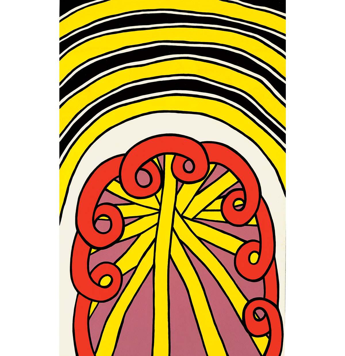
.The Battle of Bull Run, 1963
Nicholas Krushenick’s The Battle of Bull Run blazons forth, presenting the viewer with a jaunty display in red, yellow, mauve, black, and white. The shapes are familiar, linked to the contemporary mass culture urban scene, yet impossible to absolutely identify. The title has no dear connection with the composition. The artist habitually lifted titles from suggestions by family and friends. or from the titles of the rock and roll music with which he filled his studio while working.Variously linked in the 1960s with Pop Art, Systemic Painting, and Hard Edge Abstraction, Krushenick’s work sits uncomfortably within any one of these categories, existing in a dynamic world all its own.
The Battle of Bull Run, like the majority of Krushenick’s work, has a sense of bilateral symmetry, energized by wavy shaped edges that impart a pulsating organic quality to the parts. The forms are large, crowding the canvas edges, suggesting that we stand close-up in the midst of this brilliantly hued world. The impact of the canvas owes much to the clean even application of flat color in areas separated by black lines. Krushenick’s simple color patterns drew comparisons with Matisse’s late Jazz collages, while black-lined shapes suggested links with Leger and 1960s Lichtenstein. Krushenick admired Matisse, but found his expression too European for direct influence, and noted that Leger and Lichtenstein were basically figurative artists, while he was an abstract painter.
Born in the East Bronx, Krushenick remembers being mesmerized as a boy with a mural that magically took shape between his weekly Sunday attendance at his neighborhood Greek Orthodox church. After a stint in the Army, he studied at New York City’s Art Students League (1948-1950) and with Hans Hofmann (1950-1951). With his brother John, he founded and ran the co-op Brata Gallery from 1958-1962, showing among others, Ron Bladen, Al Held, and George Sugarman. Peter Halley cogently noted that these artists shared with Krushenick, “the desire to transform the physical energy of AbEx [Abstract Expressionism] into a vocabulary of coolly produced, impersonal, industrial and commercial-looking forms.”
Krushenick was inspired by walking around Manhattan, noting patterns like “the way a fire escape is hanging or a neon sign…blinking someplace.” These contributed to detailed colored drawings. When a drawing promised “a certain kind of dynamic element…a certain kind of mystery,” Krushenick used it as the basis for a painting. Each painting proceeded intuitively, modifying the ideas in the drawings as the painting evolved when the colors and patterns did not work at the enlarged scale. Each work was “as different as possible,” the opposite of making a systemic series.
Krushenick wanted his works to last. From 1959 onward, he used Liquitex paint because it not only gave him the kind of hard, clear colors he wanted, but was reported to last “roughly a thousand years.” The artist was happiest when a composition emerged with no major changes as it progressed. Such a painting, he observed, had the “certain beautiful surface quality” for which he strove. If the emerging design lacked energy, he would “rip out” a section and replace it with thick even strokes to get the “power feeling …the wild kind of color power” he sought. A raking light reveals that The Battle of Bull Run once had some red “volutes” and radiating yellow bands in its upper half, now filled with a curving field of yellow, black, and white stripes.
The Battle of Bull Run dazzles and excites. Its power eludes verbal explication. As John Perrault wisely stated, “No cool description of Nicholas Krushenick’s beautiful, energetic paintings will do them total justice. Analysis excludes joy. “

Copyright © 2026 Cranbrook Art Museum. All rights reserved. Created by Media Genesis.